Displaying data in a chartI am going to tech you how to make some very simple charts to display your data. This page is written for Y7 students but will be useful for all of those who want to display data in charts for school projects and coursework. For those of you who are at a more advanced level you may find the link below useful. It will teach you how to make more complicated charts to display your data!
There are lots of different sort of chart you can use to display data, but they can be split into theree main types:
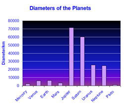
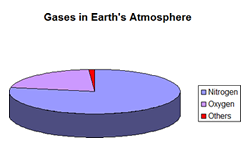
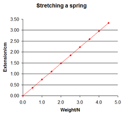
Take a look at the options open to you. We are going to look in detail at the Column or Bar chart, the Pie chart and the XY scatter chart which will allow you to draw a line graph for science.
|
|

Custom Search


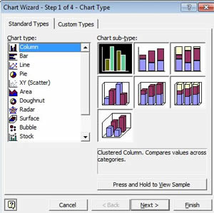 If you click on it the first page of the chart wizard will open.