Website Design: Colour SchemeYour site's colour is important. Using colours conveys the 'feeling' you want to impart. It gives the user a subliminal message about your site - and that often affects their decision as to whether they should stay on your page or not! Your design may be completely from scratch or it may be for another person. If it is for a company you will have to incorporate the company logo into the pages and that will limit the colours you can work with. If you have a logo to work with then extract as many colours as you can and lay them all out in a single image and play about them to see how they combine. There is a brilliant app that does this for you. I uploaded the image (drawn by Andrew Jones) and it selected the colours - click on the image below to try it out with your own graphic.
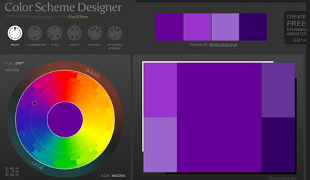
Colours chosen may depend on the demographic you wish to appeal to. Bright, primary colours for kids, muted/dark colours for teens and neutral unobtrusive colours for more mature users. Colours relate to whether you are dealing with a bright and breezy subject or one that is mysterious or clinical and technical. Sometimes you wish to present a subject that is perceived as difficult by the general public - your colour choice can either debunk that prejudicial idea or emphasise it! It is an idea to look at sites on the web that are of a similar ilk to the one your are launching - looking at those sites alllows you to experience the 'feel' of them and decide what to go for! Once you have decided on a sceme test it in all of the main browsers (colours can be slightly different in different browsers). The site below has a brilliant app for you to use when doing this. It is very 'instinctive' to use - and it gives you the colour hex value. Try it out! Click on the graphic below to open the site and have a play with it.
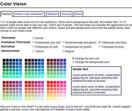
Your sight and colour blindness One in twelve people have a colour defect in their eyes. That is a lot of people - a lot of people who will not see your site as you do! If you have normal vision the majority will see the site as you do - but some won't. If you have a colour defect the majority won't see it as you do. The link below takes you to a sight that shows how colours look for people with sight defects. After you have chosen your colours always check that they provide good enough contracst for those with sight defects.
|
|

Custom Search